A Proper Title Screen
Identity » Devlog
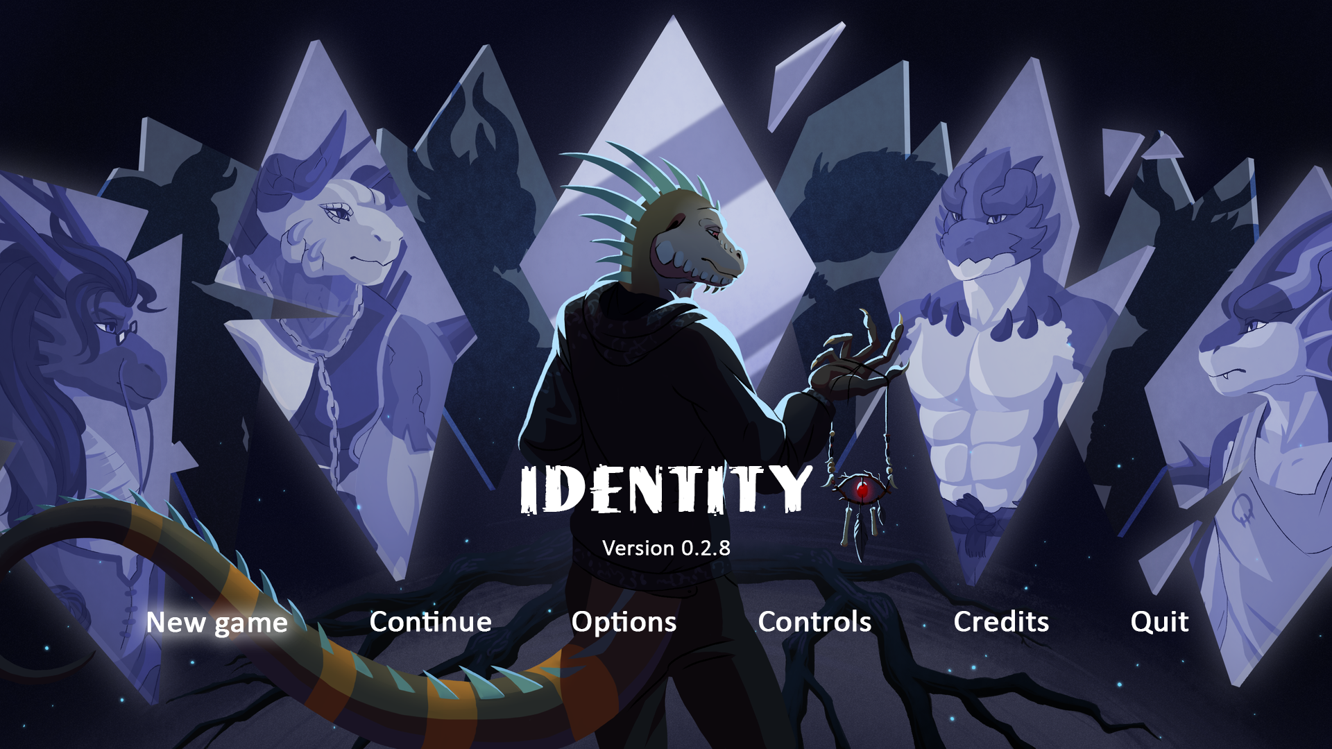
Identity has gone on for far too long without a title screen that would accurately reflect the theme and art direction we are following. So this time around, we'd like to present you a proper design that we have been working on lately!
As for the menu button layout, we fiddled around with some designs but ultimately came up with this:

We're still experimenting with it, but this should give you a rough idea for what's to come. What do you all think of it? We'd love to hear your feedback in the comments!
Get Identity
Download NowName your own price
Identity
Who would you be without your memories?
| Status | In development |
| Author | Juicy Drake Studios |
| Genre | Visual Novel, Interactive Fiction |
| Tags | Bara, Dating Sim, Dragons, Erotic, Furry, Gay, Horror, LGBT, Mystery |
| Languages | English |
More posts
- Identity: Version 0.3.15c – Public Release51 days ago
- Identity: Version 0.3.14 – Public ReleaseJul 15, 2025
- Identity: Version 0.3.13c – Public Release and Catchup on Version 0.3.12May 15, 2025
- Identity: Version 0.3.11 – Public ReleaseOct 30, 2024
- Identity: Version 0.3.10a – Android HotfixAug 28, 2024
- Identity: Version 0.3.10 – Public ReleaseAug 27, 2024
- Identity: Version 0.3.9a – Public ReleaseSep 28, 2023
- Identity: Version 0.3.8—Public ReleaseApr 21, 2023
- Version 0.3.7 Public ReleaseSep 20, 2022
- Happy Easter & Project News!Apr 15, 2022

Comments
Log in with itch.io to leave a comment.
The game's cover is very beautiful and I think it has a good feel for the work
This title screen is nice nothing bad to say about it.
this title screen is badass even tho its not another update i am satisfied cant wait to see what else you come up with JDS